
 Caroline Griffin
2025 M+R Benchmarks: What Nonprofits Must Know About Online Giving and Donation Pages
If you're in nonprofit fundraising, the M+R Benchmarks report is basically required reading.
Product Spotlight

Mobile-First Pop-Up Donation Form
Launch mobile-first pop-up forms in minutes, use built-in tools to capture more donations, and optimize the giving experience—no dev team required.

The 4 Types of Online Donation Experiences
89% of donors leave without giving. Learn how to use the right donation form to close the gap and boost conversions.


If you're in nonprofit fundraising, the M+R Benchmarks report is basically required reading.
.jpg)
A Preparation Guide for Giving Tuesday, Year-End Giving, and Peak Fundraising Season For most nonprofits, the second half of the year drives the...
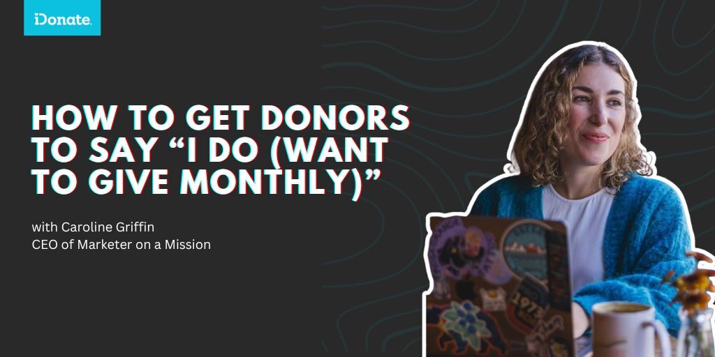
Monthly giving is growing in popularity fast, while the number of people making more traditional annual gifts is shrinking. The 2025 M+R Benchmarks...