
 Caroline Griffin
Spring Campaign Success: Using Storytelling to Stand Out in Crowded Nonprofit Inboxes
In the digital fundraising landscape, nonprofits with compelling stories see higher donation completion rates than those relying on facts alone. As...
Product Spotlight

Mobile-First Pop-Up Donation Form
Launch mobile-first pop-up forms in minutes, use built-in tools to capture more donations, and optimize the giving experience—no dev team required.

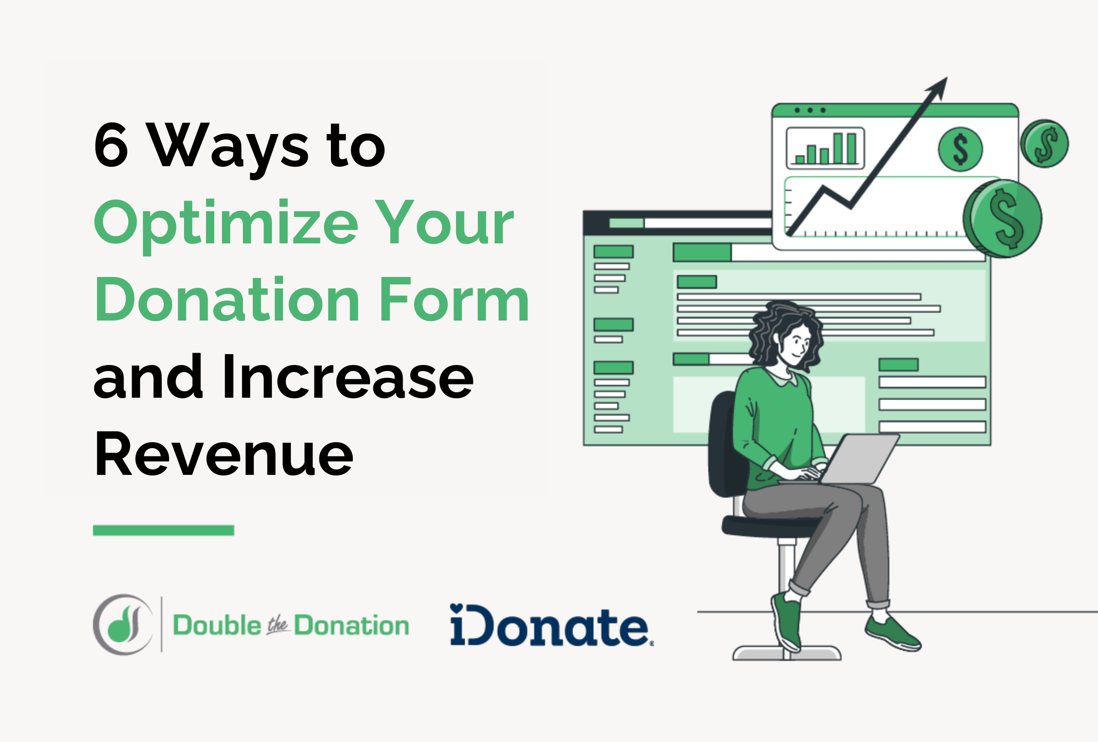
The 4 Types of Online Donation Experiences
89% of donors leave without giving. Learn how to use the right donation form to close the gap and boost conversions.

When it comes to donation forms, small tweaks can make a big difference. One of the most overlooked—but high-impact—choices a nonprofit can make is how their donation form appears: Should it live inside a modal pop-up or on a full-width standalone page?
Each format has its perks, pitfalls, and best-use scenarios. The right choice will depend on your campaign goals, audience, and traffic sources. I highly recommend using a fundraising platform that offers both formats to experiment with, because a little A/B testing can go a long way.
Let’s explore the pros and cons of each format, results from a few existing A/B tests (including my own), and when I recommend using the pop-up vs. the full-width form.
A pop-up or modal donation form is a pop-up window or overlay that sits over a webpage. This may be triggered by clicking a “Donate” button on your website, or it may have a unique URL to load automatically. Using this format, a donor never leaves your website—they donate entirely using the overlay window. Example from Midwest Food Bank:

Faster action: Donors stay on the same page, which can reduce friction. A modal can feel quick and urgent—perfect for a campaign countdown or Giving Day push.
Fitting for mobile: On mobile, modals often perform well by keeping the user on one tab, with minimal load time.
A built-in second chance: People who click out of a pop-up are still on your website, where they might read the underlying webpage and decide to donate or take another action.
Multi-step forms outperform single-page forms: On some platforms, the pop-up donation form offers a multi-step process compared with the full-page form, where all fields must be filled in at once. Multi-step donation forms tend to significantly outperform single-step forms.
Limited storytelling space: You have less real estate for rich copy or supporting visuals.
Easier to abandon: It can be habitual to X out of pop-up style forms, even before reading what they say.
May be blocked by browsers: Some older browsers or privacy tools may interfere with pop-up functionality.
A full-width donation page is a standalone page designed specifically to host your donation form. Think of it as a custom landing page where you can control layout, content, imagery, and more. Example from Connie Maxwell Children's Ministries:

More Space for storytelling: You have more real estate to build a narrative with motivational tools like impact stats, donation equivalencies, and testimonials.
Ideal for new audiences: If someone new (or new-ish) to your organization clicks from a social ad or social media post, you can meet them with context-rich content.
Usually better for sharing: Full pages always have unique URLs that can be customized and shared. *Some pop-up donation forms offer this, too, but the person who receives the link might instinctively click out of the pop-up.
Marketers have long debated pop-ups vs. standalone landing pages, and the reason you still see both all over the place is because there’s no universal winner.
Unbounce research has shown that full-width landing pages can significantly outperform pop-ups when the visitor is new or arriving from an outside source, such as a campaign ad.
On the flip, Blackbaud research shows a whopping 90% increase in donations when using a multi-step donation experience, which I see on pop-up forms more often than full-width donation pages.
I have run multiple Meta Ad campaigns for clients A/B testing pop-ups vs. full-width donation forms. These ads have targeted a mix of people who are familiar with the organizations and people who are brand new.
In my tests, the two have either performed the same or the full-width form has performed slightly better. The only times I’ve seen the full-width form measurably outperform the pop-up is when that full-page form includes a goal meter or other interactive element that didn’t fit on the pop-up.
Here’s a mini question tree to help you make sense of all this. First, ask:
There’s one more layer:
Testing is always an awesome idea. At the beginning of your next campaign, try splitting your email list to test both donation page formats, then use the winning format for the remainder of the campaign. Or, mix it up throughout the campaign so people see both versions. A specific person may respond better to one over the other!
There’s no universal winner between modals and full-width pages. But when you understand how each one functions—and imagine both from the perspective of a brand new contact compared to a devoted fan—it will make the choice easier in each situation.
iDonate just launched new pop-up donation forms, so you can test and tailor the experience every time. If your donation platform offers both of these formats and you have already seen a clear winner, please message me on LinkedIn so I can share your findings!
About the Author
Caroline Griffin has worked in nonprofit marketing, communications, and digital fundraising since 2013. She has seen it from all angles: in-house as a marketing team of one, agency-side serving dozens of clients over the years, and as a solo consultant since 2020.
About Marketer on a Mission
As the Marketer on a Mission, Caroline helps nonprofits grow their fans and funds online with donor research, strategy, and implementation support. You can check out her website to learn more and sign up for her monthly newsletter, The Good Stuff.

In the digital fundraising landscape, nonprofits with compelling stories see higher donation completion rates than those relying on facts alone. As...
In the continuously growing trend toward digital fundraising, an organization’s donation form is its most invaluable resource. However, not all...

In the world of digital fundraising, every click, page visit, and every donation tells a story.