
Nonprofit Donation Page Basics: How to Optimize for More Donations
Why Your Donation Page Matters More Than You Think Imagine this: a potential donor clicks through to your nonprofit’s donation page, ready to support...
Features
Product Spotlight

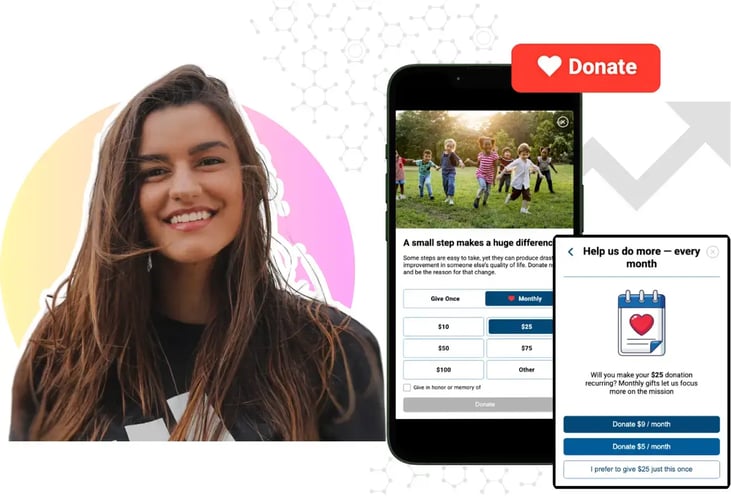
Mobile-First Pop-Up Donation Form
Launch mobile-first pop-up forms in minutes, use built-in tools to capture more donations, and optimize the giving experience—no dev team required.
By team
The essentials
New to online donation pages for your nonprofit? Start here.
Donation page A/B testing - no science degree needed.
Keep your donation page loading fast - and drive higher conversions.
Digital fundraising resources

The 4 Types of Online Donation Experiences
89% of donors leave without giving. Learn how to use the right donation form to close the gap and boost conversions.
More people are using their phones to visit nonprofit websites, but mobile donation completion rates still tend to fall behind desktop.
People definitely want to give, but it's the donation process can create unnecessary obstacles. Long forms, slow pages, and a difficult mobile experience can cause donors to leave before completing their donation.
The good news is that many of these issues can be fixed with a few changes to the donation experience. Here are 7 mobile user improvements that can help make giving easier and reduce lost donations.
Every additional field creates another step for donors to complete. On mobile devices, where typing can take longer and screens are smaller, unnecessary fields can make the donation process feel more difficult.
Review your donation form and remove any information that isn't needed to process the gift. Try combining address fields when possible, and consider asking questions such as "How did you hear about us?" to a follow-up page after the donation is complete.
iDonate approach: iDonate's giving forms are designed to keep the donation process simple by focusing on only the information needed to complete a gift. Organizations can also customize their forms through the Form Builder and choose which fields are needed to them.
Even the tiniest details in a donation form can have the biggest impact on the user experience. If a donor is entering a phone number or donation amount, they should only see a numeric keyboard instead of a full letter keyboard. Extra steps and unnecessary typing can make the process more frustrating, especially on mobile.
iDonate approach: iDonate forms are built with the correct input settings by default, helping create a smoother mobile giving experience without organizations needing to manually adjust technical settings.
A slow donation page can cause donors to leave before they ever complete their gift. When a page takes too long to load, even heavily interested supporters may move on.
Use tools like Google PageSpeed Insights to identify areas where your donation page can improve. Common issues include large images, unnecessary scripts, and design elements that slow down the page.
Small improvements to loading speed can create a better experience for donors and make it easier for them to complete their donation.
iDonate approach: iDonate's giving forms are designed to load efficiently and work smoothly within a nonprofit's website, helping donors access the form without unnecessary delays.
Suggested donation amounts help make the giving process faster by giving donors a few options to choose from. The amounts need to feel realistic. If they are too high, too low, or don't match what your supporters typically give, they may create confusion instead of helping.
Use past donation data to choose amounts that make sense for your audience, while still allowing donors to enter a custom gift amount. On mobile, make sure these options are easy to select without extra steps.
iDonate approach: iDonate's Form Builder lets organizations set suggested donation amounts, highlight a recommended option, and add impact statements like "$50 provides 10 meals" to show donors how their gift supports the mission.
Entering a full card number on a phone can make the donation process take longer than necessary. Digital payment options like Apple Pay and Google Pay allow donors to complete their gift faster by using the payment methods already saved on their device. Most people these days are always tapping their phone with Apple Pay.
Make these options easy to find on the donation page instead of hiding them after the card form. The easier it is for donors to complete their gift, the more likely they are to finish the process.
iDonate approach: iDonate's giving forms support payment options like Apple Pay, Google Pay, and PayPal, making it easier for donors to choose the payment method that works best for them.
Donors want to feel confident that their information is safe before completing a gift, especially when giving from a mobile device. If security details are difficult to find, some supporters may hesitate before finishing the donation process.
Include clear signals directly on the donation form, such as secure payment messaging, accepted payment options, and a short statement explaining that donor information is protected. These details should appear near the payment section where donors are making their decision.
iDonate approach: iDonate's Form Builder allows organizations to add customizable trust messaging within the payment section, helping reassure donors during the giving process.
Many nonprofits focus on getting the donation completed but don't see what happens after. A simple thank-you message is important, but the confirmation page is also an opportunity to continue the relationship with the donor.
Use this page to show the impact of their gift, share what their donation supports, and encourage them to stay connected with your organization. For some, this can also be a good place to introduce options like recurring giving or social sharing.
iDonate approach: iDonate's Success Page section allows organizations to customize confirmation messages, add impact statements, and include sharing options based on each campaign.
Overview
Improving mobile donations doesn't always require a complete redesign. Simple changes, like shortening forms, improving page speed, adding easier payment options, and making security information clear, can make it easier for donors to complete their gifts.
The organizations see better mobile results and are usually the ones focused on removing unnecessary steps from the giving process. A smoother donation experience helps reduce abandoned gifts and makes it easier for supporters to follow through.
If your current donation platform makes these changes difficult or limits what you can customize, it may be time to consider whether your tools are supporting your fundraising efforts.
iDonate's giving forms are built around donor conversion. Every fix in this article is part of our platform by default. Request a demo and see your form's completion rate potential.
Why Your Donation Page Matters More Than You Think Imagine this: a potential donor clicks through to your nonprofit’s donation page, ready to support...
Bill High, Executive Chairman & Founder of The Signatry: A Global Christian Foundation, gives insight into what he looks for in a nonprofit’s...
Your donation page is often the final step between a supporter's good intentions and an actual gift. Yet for many nonprofit and university...