
Skip to the main content.

Product Spotlight

Development Solutions Page Hero-1

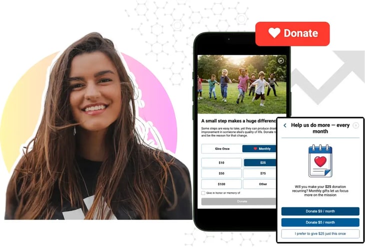
Mobile-First Pop-Up Donation Form

Launch mobile-first pop-up forms in minutes, use built-in tools to capture more donations, and optimize the giving experience—no dev team required.

The essentials

Donation page basics

New to online donation pages for your nonprofit? Start here.

Donation page A/B testing manual

Donation page A/B testing - no science degree needed.

Optimizing donation page load times

Keep your donation page loading fast - and drive higher conversions.

Recent

four-types-of-online-donation-experiences

The 4 Types of Online Donation Experiences

89% of donors leave without giving. Learn how to use the right donation form to close the gap and boost conversions.

How to Diagnose Donation Page Drop-Offs
11:45

How to Diagnose Donation Page Drop-Offs

You know your donation page isn't converting the way it should. What you don't know is why.

That's the problem.

Your CRM can tell you how much you raised last month. Your donation platform can tell you how many gifts you processed. But unless you're looking at what happens between the moment someone lands on your donation page and the moment they complete a gift, you may have no idea where you're losing donors or what is causing them to leave.

And that's where most donation page conversion optimization goes wrong.

Too many fundraising teams jump straight to redesigning the form, removing fields, adding features, or following the latest industry benchmark. But a benchmark can tell you what other organizations are experiencing. It can't tell you what's happening on your nonprofit donation pages.

The better approach is to diagnose the friction before you try to fix it.

Here's how to identify where donors are dropping off, understand what's causing it, and determine whether a change actually improves fundraising performance.

Your donation page has a measurement problem

Most fundraising platforms are built to measure completed transactions. That's useful, but it tells only part of the story.

They can tell you that 1,000 people donated and that you raised $150,000. They may not tell you that another 4,000 people started the donation process and abandoned it. They may not tell you whether those donors dropped off on mobile, got stuck on a particular field, or left after encountering an unexpected prompt.

In other words, your reporting tells you what happened. It often doesn't tell you why.

That distinction matters because the most important opportunities to improve your donation experience often happen before the transaction is complete.

If your conversion rate drops, the answer isn't necessarily a new form. First, you need to know where the friction is.

Start with conversion rate, not revenue

Revenue is the outcome you're ultimately trying to improve, but it's not the best place to diagnose form performance.

Revenue can swing for reasons that have nothing to do with your donation experience: a viral appeal, a major gift, a seasonal campaign, or simply a slow news week.

Conversion rate gives you a cleaner signal.

Calculate it as completed gifts divided by the number of people who reached your donation page. Then establish that baseline by device and form type.

That's the number you can actually optimize.

But there's an important caveat: a higher conversion rate isn't automatically a better outcome.

A form that produces more transactions but smaller gifts can increase conversion while reducing revenue. A feature that generates more one-time gifts but fewer recurring donors may look successful if you're measuring only conversion.

That's why the goal isn't simply to get more people through the form.

The goal is to create a donation experience that generates more value from the people who arrive.

What our data tells us about form structure

iDonate's 2026 Donor Engagement Benchmark Report compared giving data from the same nonprofits before and after they changed their donation forms. The analysis controlled for seasonality, traffic mix, and calendar events to isolate the impact of the form itself.

The results challenge the idea that all modern forms perform equally.

iDonate client organizations that moved from a legacy embedded form to a Smart Popup form saw:

  • 228% increase in conversion
  • 183% increase in recurring signups
  • 35% increase in daily revenue

The lesson isn't that every nonprofit should install a Smart Popup form. It's that form structure matters more than many fundraising teams realize.

And before you decide which structure is right for your organization, you need a baseline that tells you how your current experience performs.

Look at the mobile donation experience first, but don't assume it's the problem

Industry data gives us a useful starting point.

Mobile now accounts for roughly half or more of nonprofit website traffic, according to M+R Benchmarks 2026. Yet desktop visitors still convert better. M+R found that desktop visitors completed a gift at an 11% rate on primary donation pages, compared with 8% for mobile visitors.

Desktop also accounted for 57% of transactions and 72% of revenue, despite representing less than half of traffic. Average gift size followed the same pattern: $168 on desktop compared with $88 on mobile.

Other industry data shows just how significant mobile has become. Roughly 43% of online donations were made from a mobile device last year, according to Nonprofit Tech for Good. Double the Donation puts mobile's share of traffic even higher at 57%.

So yes, the mobile donation experience is the first place I'd look.

But don't confuse an industry benchmark with your own diagnosis.

If mobile conversion is significantly lower than desktop on your donation page, you have a problem worth investigating. If it isn't, don't redesign your experience simply because the industry average says you should.

Segment your data by device and look at:

  • Conversion rate
  • Time on form
  • Field-level drop-off
  • Average gift
  • Recurring gift signups
  • Total revenue

Then test the experience yourself.

Open the form on an actual phone. Use a real network connection. Thumb-scroll through it like a donor. Look for slow load times, tiny tap targets, confusing fields, unnecessary scrolling, and anything that requires zooming.

The benchmark tells you where to look. Your own data tells you what to fix.

Don't optimize for conversion at the expense of revenue

This is where donation form optimization gets more interesting.

The conventional advice is often to make a form shorter and remove anything that creates friction. But iDonate's data suggests the answer is more nuanced.

Custom fields are a good example.

Adding two to four custom fields, such as designation, tribute information, or employer, lifted daily revenue by 84% to 100% compared with a baseline legacy form with no custom fields.

But add more than five fields and revenue dropped by roughly a third.

That doesn't mean custom fields are good or bad.

It means there is a point at which additional information creates more friction than value.

The same principle applies to other donation form features:

  • Fee coverage requests increased conversion 27% but reduced daily revenue 15%. More gifts did not translate into more revenue.
  • Custom donation amounts increased conversion 24% and gift size 15%, but daily revenue still declined 9%.
  • Corporate matching prompts were the rare clear win, increasing conversion, gift size, and revenue together.

These findings point to a bigger lesson:

You can't optimize a donation form by looking at one metric.

Conversion, average gift, recurring giving, and revenue all tell you something different about donor behavior. A change that improves one metric can hurt another.

The best optimization is the one that improves the outcome that matters to your organization.

Find the donor abandonment your reporting can't show you

If your donation platform stops reporting at "gift completed," you need another way to see what happens before the transaction.

That's where donor abandonment becomes important.

A donor who leaves before completing a gift doesn't necessarily represent a lost donation because of one specific problem. They may have encountered a confusing field, a slow page, an unexpected fee, a missing payment option, or a form that simply required too much effort.

Without visibility into those behaviors, you're left guessing.

That doesn't necessarily mean replacing your technology stack. It means adding visibility where you don't have it today.

Session replay and heatmaps

These tools can show where a visitor hesitates, scrolls back, or abandons the form. They can help you see behavior that a standard donation report will never capture.

Funnel tracking

Build a custom event funnel in your web analytics platform to see how many visitors reach each stage of the donation process.

You might discover that 80% of visitors reach the payment step but only 50% complete it. That's a very different problem from a form where half of your visitors never get past the first screen.

A/B testing

When your donation platform supports it, test one variable against your own traffic.

Test two custom fields versus four. Test an optional prompt versus no prompt.

Don't assume the industry benchmark applies to your audience.

Your donors are the most relevant benchmark you have.

Post-abandonment surveys

Quantitative data can tell you where donors leave. Qualitative feedback can help explain why.

A short survey can uncover confusion, trust concerns, missing payment options, or other barriers that aren't obvious from analytics alone.

These are just a few analytics alternatives that can help turn your donation form from a black box into something you can actually diagnose.

Five questions to answer before redesigning your donation form

Before you replace your form, add features, or launch a redesign, answer these five questions:

  1. Where are donors dropping off? Segment the funnel by device and identify the exact stage where abandonment increases.
  2. How many fields are you asking donors to complete? Two to four custom fields may increase revenue, while adding more than five can have the opposite effect.
  3. Which features actually create value? Don't assume that more options or more functionality will produce more revenue.
  4. What happens to revenue when conversion changes? A conversion lift is only valuable if the additional transactions create meaningful value.
  5. Have you tested the change against your own donors? Industry benchmarks provide context. Your own data should drive the decision.

These questions can prevent one of the most common mistakes in donation page conversion optimization: redesigning before diagnosing.

The real goal isn't a better-looking donation page

The best nonprofit donation pages aren't necessarily the shortest ones.

They aren't necessarily the newest ones.

And they aren't necessarily the ones that follow the latest industry benchmark.

They're the ones that make it easiest for your donors to complete a gift while generating the greatest value for your organization.

That requires a different approach to conversion problems.

Start with your baseline. Segment the data. Find the friction. Form a hypothesis. Test it. Then measure the outcome across conversion, gift size, recurring giving, and revenue.

Don't optimize based on assumptions when you can optimize based on evidence.

That's the difference between redesigning a donation page and actually improving it.

iDonate's mobile-first donation pages, popup forms, and recurring gift prompts are built around findings like these. Rather than asking fundraising teams to start their diagnosis from zero, we use data from real donation experiences to understand what drives better performance at scale.

If you're ready to see what a redesigned donation experience could do for your organization, book a demo.


How is your donation experience stacking up to benchmarks?

How is your donation experience stacking up to benchmarks?

Every spring and summer, the nonprofit benchmarks pour in. I can barely keep up with all of the new reports and case studies in my inbox. I bet you...

Read More
How to Customize Donation Pages Without Heavy IT Involvement

How to Customize Donation Pages Without Heavy IT Involvement

Your donation page is often the final step between a supporter's good intentions and an actual gift. Yet for many nonprofit and university...

Read More
2025 M+R Benchmarks: What Nonprofits Must Know About Online Giving and Donation Pages

2025 M+R Benchmarks: What Nonprofits Must Know About Online Giving and Donation Pages

If you're in nonprofit fundraising, the M+R Benchmarks report is basically required reading.

Read More